For a long time, web developers have had to use border and pseudo-element hacks to style the gaps between items in grid and flexbox layouts. With CSS gap decorations fully supported in Chrome and Edge starting with version 149, you can now style gaps easily and with a high degree of control.
The Edge web platform team at Microsoft led both the design and standardization of the feature, and the implementation is rolling out across all Chromium-based browsers. For background, check out an early preview of gap decorations by Patrick Brosset, and a full deep dive about the stable release by Javier Contreras.
Catching Up on Gap Decorations
Gap decorations extend the familiar column-rule CSS property, which already works in multi-column layout, and makes it work in grid and flexbox layouts too. There is also now support for the row-rule property, so that decorations can be displayed in both axes. The syntax is extended to provide a lot more control over the decorations.
Since the early preview, a few things have changed — including property renames for clarity and new properties informed by developer feedback during early testing.
Here is a summary of the changes:
| Old | New | What this change means |
|---|---|---|
row-rule-outset / column-rule-outset | row-rule-inset / column-rule-inset | ”Outset” became “inset” and setting these properties now insets the rules inward from the decoration edges. |
No fine-grain control of where row-rule-inset and column-rule-inset apply | New longhand properties: row-rule-inset-cap, row-rule-inset-junction, row-rule-inset-start, row-rule-inset-end, and column-rule-inset-cap, column-rule-inset-junction, column-rule-inset-start, column-rule-inset-end | You can now inset the outer ends (caps) and intersections (junctions) independently, as well as the start and end of decorations independently. |
gap-rule-paint-order | rule-overlap | Renamed for clarity. Controls how decorations layer where row and column rules cross. |
| N/A | rule-visibility-items | New property that controls whether rules show next to empty areas in a container. |
Browser Support
Gap decorations are available in Chrome and Edge starting with version 149, and in other Chromium-based browsers that match those versions. Other browser engines have been receptive and engaged in standards venues, so over time this feature will become interoperable.
If you want to use it now:
- If you consider these decorations to be a progressive enhancement, just start using the feature today — nothing will break on browsers that don’t support it.
- If you absolutely need gap decorations, a polyfill is in development for browsers that don’t yet have support.
Building a Demo
The following examples expand on the demo used in the early preview article, adding new sections and using the latest gap decoration features along the way.
Start with some minimal HTML markup:
<body>
  <header>
    <h1>My personal site</h1>
    <p class="tagline">...</p>
  </header>

  <nav>
    <ul>
      <li><a href="#home">Home</a></li>
      <!-- etc. -->
    </ul>
  </nav>

  <section id="home" class="home">
    <div class="greeting">
      <p class="lead">...</p>
    </div>
    <div class="photo">
      <img src="cat.jpg" alt="A sleeping cat.">
    </div>
    <aside class="now">
      <h3>Currently</h3>
      <ul>
        <li>Lorem <span>— ipsum dolor sit amet</span></li>
        <!-- etc. -->
      </ul>
    </aside>
    <div class="note">
      <p>...</p>
    </div>
    <div class="photo">
      <img src="tree.jpg" alt="An old olive tree trunk.">
    </div>
  </section>

  <section id="blog" class="blog">
    <h2>Blog</h2>
    <div class="posts">
      <article class="post">
        <span class="date">June 2025</span>
        <h3>Lorem ipsum dolor</h3>
        <p>...</p>
      </article>
      <!-- rest of articles -->
    </div>
  </section>

  <section id="about" class="about">
    <h2>About</h2>
    <div class="bio">
      <img class="avatar" src="bike.jpg" alt="A bicycle leaning against a post.">
      <div class="text">
        <p>...</p>
        <!-- etc. -->
      </div>
    </div>
  </section>

  <section id="links" class="links">
    <h2>Elsewhere</h2>
    <ul>
      <li><a href="#">GitHub</a></li>
      <!-- etc. -->
    </ul>
  </section>

  <footer>
    <p>© 2025 My personal site.</p>
  </footer>
</body>
The starting CSS makes the page a single big grid, with row rules acting as section dividers. The navigation area is a flexbox layout with dashed column rules:
body {
  display: grid;
  gap: 4rem;
  margin: 2rem;
  row-rule:
    1rem solid #efefef,
    repeat(2, 2px solid #efefef);
}

nav ul {
  display: flex;
  flex-wrap: wrap;
  gap: 2rem;
  column-rule: 2px dashed #666;
}
Step 1: Support Any Number of Sections with repeat(auto)
The initial CSS uses repeat(2, 2px solid #efefef) because the original site had three static sections. To automatically adapt as new sections are added, swap the hard-coded repeat count for an auto repeater:
body {
  /* ... */
  row-rule:
    1rem solid #efefef,
    repeat(auto, 2px solid #efefef);
}
Step 2: Decorate Flexbox Gaps in the Home Section
For the home section, a wrapping flexbox container holds text and images. The .home element defines the flexbox layout, and child elements use different flex-basis values:
.home {
  display: flex;
  flex-wrap: wrap;
  gap: 3rem;
}

.home > * {
  flex: 1 1 12.5rem;
}

.home .greeting {
  flex-basis: 26.25rem;
}

.home .note {
  flex-basis: 22.5rem;
}
Here is the home section without decorations:

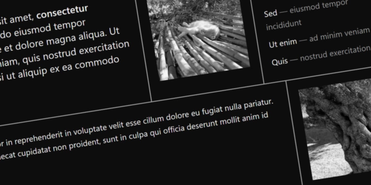
Adding gap decorations with the row-rule and column-rule properties:
.home {
  /* ... */
  row-rule: 2px solid #999;
  column-rule: 2px solid #999;
}
Because both rules share the same value, they can be collapsed into the new rule shorthand:
.home {
  /* ... */
  rule: 2px solid #999;
}
By default, column rules run the full height of each flex line. With a 3rem gap, the two flex lines are separated. To make the column rules meet the row rule, use the column-rule-inset property with its overlap-join value. This joins adjacent rules at junctions while keeping the outer ends (caps) flush at 0:
.home {
  /* ... */
  column-rule-inset: overlap-join;
}
With overlap-join applied, column rules extend to meet the row rule at intersections, creating a clean connected grid appearance across the wrapping flexbox layout.