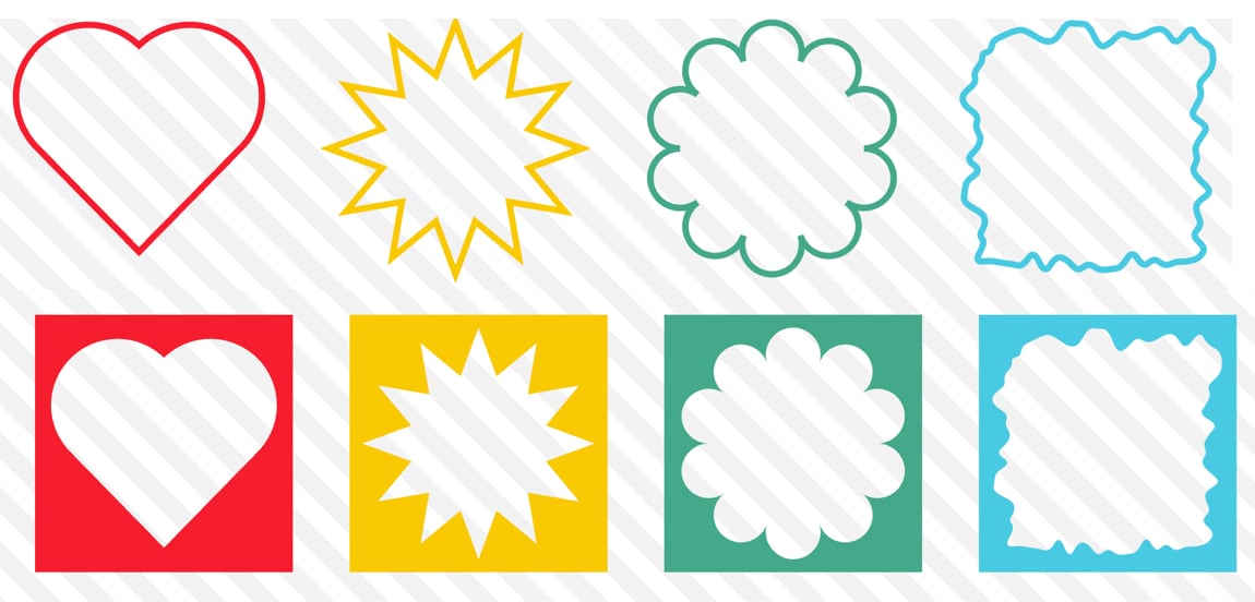
We recently got the new shape() function (now Baseline!) as well as the corner-shape property. What else could we possibly need as far as making shapes in CSS? Let me tell you: the border-shape property!
If you are not a CSS shape fanatic, you probably missed these features when they came out, so let’s give them brief, formal introductions, starting with…
shape() and corner-shape
The shape() function is a new value for clip-path and offset-path that uses SVG syntax to create CSS shapes much more easily than, say, path(). There is a four-article series exploring this feature, and another article exploring the creation of complex shapes.

Speaking about SVG, you can express any SVG shape using shape(). Said differently, you can convert any SVG shape into a CSS shape, and there is a converter that does exactly that.
As for corner-shape, it’s a property that works in conjunction with border-radius. As its name suggests, it allows you to control the shape of an element’s corner using predefined keywords.
.corner {
  border-radius: 20px;
  corner-shape: round | scoop | bevel | notch | squircle;
}
It can also be used to create common CSS shapes, as covered in “CSS Shapes using corner-shape”.

Is corner-shape really useful or even needed? Except for the squircle value, most of the shapes can already be created using clip-path or mask. But what corner-shape does that these others can’t is easily add borders and other decorations to those shapes.

corner-shape will not only shape the corners, but it also supports other properties like border and box-shadow, allowing them to follow the shape rather than the element’s box. This is a game-changer because adding borders to shapes has always been a major headache.
Support is still limited (Chromium-only at the time of writing), but it’s a good time to explore it and get an overview of its potential.
Enter border-shape!
Shaping corners is good, but it’s still fairly limited as far as what we can do with it. What about shaping the whole element instead? That’s what border-shape does. It accepts the same values as clip-path, including the new shape() function.
So, it has the same job as
clip-path? What’s new?
Like with corner-shape, most decorative properties such as border, box-shadow, and outline follow the shape.

clip-path (and mask) will clip/mask the whole element, including the decorations, so having borders is a big NO. That’s a major problem for creating CSS shapes.
The border-shape property is here to solve this issue. Instead of clipping the element, it “shapes” the element, allowing its decorations to follow that shape. In other words, putting borders on CSS shapes becomes straightforward.
border-shape is also very easy to use. If you are familiar with clip-path, you have practically nothing new to learn. Simply replace one property with another, and you are done.
.shape {
  /* Old code */
  clip-path: shape() | polygon() | ...;

  /* New code */
  border-shape: shape() | polygon() | ...;
}
The shape() function is what makes border-shape really powerful — the two go hand-in-hand.
Note: Support is limited to Chrome only for now, so check out the demos using Chrome.
Border-Only Shapes
The first major advantage of border-shape is adding borders to shapes that follow the actual shape, which also enables border-only shapes. All you need is:
.shape {
  border: 8px solid red;
  border-shape: /* your shape code */;
}
No more hacks and no more headaches!

Most of the shapes are already available in the CSS Shapes collection, making border-only shapes something you can start building today — as soon as browser support widens beyond Chrome.